This article provides an in-depth exploration of the implementation process with detailed explanations.
Modal in React and Tailwind
In every web app, modals play a crucial role. Crafting a Modal component that integrates well, maintains proper positioning, and ensures smooth scrolling is quite challenging. Today, we'll build one, providing code you can easily copy (ctrl + c and ctrl + v) without needing extra libraries.
We'll explore popular React patterns such as slot and content projection, then implement custom hooks to create production-ready modal.
Requirements and Challenges
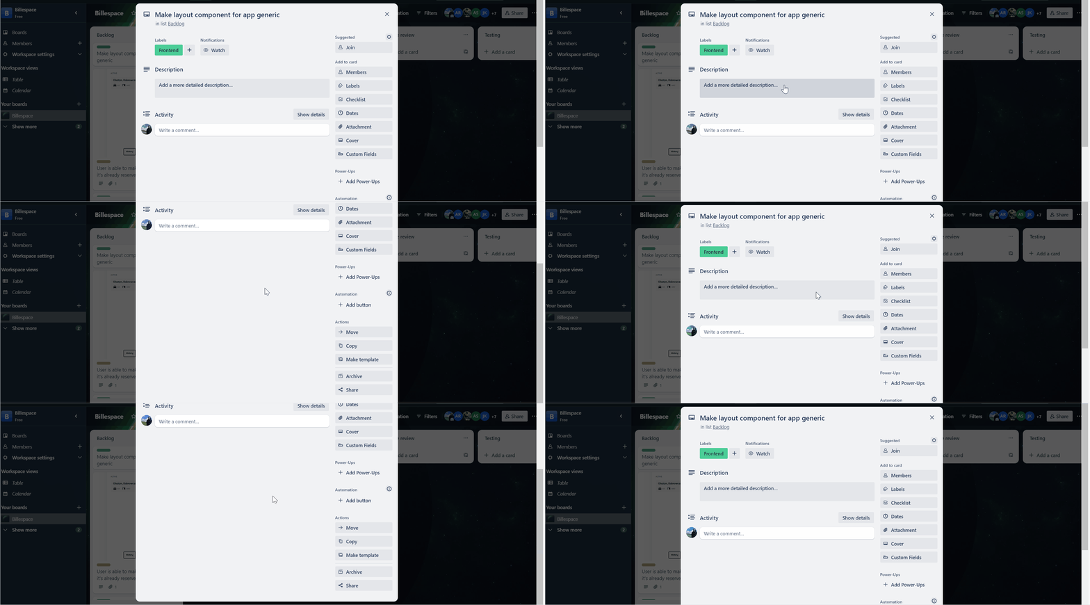
If you've used Trello, Facebook, Instagram, or similar platforms, you'll notice that modals with too much content don't scroll internally. What's the alternative approach?
In these apps, they employ a clever technique: hiding the browser window scroll and adding their scroll within the modal container. Achieving this effect requires JavaScript.
Additionally, if there's enough space for content, no scroll is added. However, the window scroll is hidden to prevent duplicate scrolling on mobile devices, which can be frustrating! Here's how it looks:
 Trello Modal
We want to achieve the same effect.
Modal API Design
The component should be as generic as possible, allowing us to render any content inside and providing default styling that we can easily override. Here's an example of how we'll use it:
<Modal className="some-custom-class pt-2">
  <ReallyLongComponentInside />
</Modal>
Let's define props interface:
// Inside modal.tsx file.
import React from 'react';

interface ModalProps {
  className?: string;
  children: React.ReactNode;
}
Modal Implementation
Now, it's time to add core implementation:
import React from 'react';
// This simplifies class concatenation.
import c from 'classnames';

interface ModalProps {
  className?: string;
  children: React.ReactNode;
}

const Modal = ({ className, children }: ModalProps) => {
  return (
    <div className="bg-black/40 dark:bg-white/20 fixed items-center justify-center flex p-4 z-20 h-[100svh] w-[100svw] left-0 top-0 overflow-y-auto">
      <div
        className={c(
          `bg-white m-auto max-w-[420px] dark:bg-black rounded-lg shadow-xl p-4`,
          className,
        )}
      >
        {children}
      </div>
    </div>,
  );
};

export default Modal;
Nothing fancy here. We've integrated the classnames library to streamline the process of creating complex classes and included some Tailwind classes. So, instead of cumbersome operations like this:
className={className ? className : " " + "my-classes"}
We can achieve the same results more easily and cleanly:
import c from 'classnames';
className={c("my-classes", className)}
While the library isn't strictly necessary, in larger applications with numerous components, incorporating this logic into each one can lead to an unwieldy codebase. So, why not improve it? Especially when the library is so lightweight - https://www.npmjs.com/package/classnames.
Hiding Window Scroll
This is the perfect case for a custom hook! Let's name it useScrollHide and implement it:
import React from 'react';

const useScrollHide = <T extends HTMLElement>() => {
  const ref = React.useRef<T>(null);
  const initialStyle = React.useRef<
    Required<Pick<React.CSSProperties, 'overflow'>>
  >({
    overflow: `auto`,
  });

  React.useLayoutEffect(() => {
    const getElement = (): HTMLElement => ref.current ?? document.body;

    const show = (): void => {
      const element = getElement();
      const style = initialStyle.current;
      element.style.overflow = style.overflow;
    };

    const hide = (): void => {
      const element = getElement();
      initialStyle.current.overflow = element.style.overflow;
      element.style.overflow = `hidden`;
    };

    hide();

    return show;
  }, []);

  return [ref] as const;
};

export { useScrollHide };
With Required<Pick<React.CSSProperties, 'overflow'>>, we've created a utility type that contains only the overflow property, which is required, while retaining the original typings.
Inside useLayoutEffect, we check for the existence of the ref. This hook also supports hiding any other scroll for HTML tag.
Afterward, we implemented show and hide functions, which set the required style for either the document.body or the ref element if it's utilized. We're returning it from the hook at [ref] as const (as const creates a tuple from an array).
Inside useLayoutEffect, we're returning the show function. After the component is unmounted, this function will ensure that the scroll is shown again.
Now, we use to attach this hook inside our modal.tsx component:
import { useScrollHide } from 'development-kit/use-scroll-hide';

const Modal = ({ className, children }: ModalProps) => {
  // Just call it!
  useScrollHide();
};
Using Portal
The modal is functioning as expected, but there's still a significant issue. The generated HTML by React will be rendered at the level of the component where it's used. Typically, modals should be added at the top of the component tree to avoid z-index problems and ensure it always stays on top.
Moreover, using position: fixed within a nested tree structure may lead to blurred fonts on some older browsers. You can find more information about this issue here: https://stackoverflow.com/questions/27385126/chrome-font-appears-blurry.
Lastly, utilizing Portals will eliminate the need to lift the state up if you want to control the modal appearance. You can simply render it inside any level, and it will be added to the top of your HTML tree.
After knowing that, let's create a hook:
import React from 'react';
import { createPortal } from 'react-dom';

const isServer = (): boolean => typeof window === `undefined`;

const usePortal = () => {
  const wrapper = React.useMemo(
    () => (isServer() ? null : document.createElement(`div`)),
    [],
  );

  React.useLayoutEffect(() => {
    if (!wrapper) return;

    document.body.appendChild(wrapper);

    return () => {
      document.body.removeChild(wrapper);
    };
  }, [wrapper]);

  return {
    render: (children: React.ReactNode): React.ReactPortal | null =>
      wrapper ? createPortal(children, wrapper) : null,
  };
};

export { usePortal };
We need to exercise caution when using browser APIs inside the body of a function for hooks. To prevent exceptions on the server side (e.g., when used with Next.js), we should add a check to verify the environment where the code is executed. The isServer function handles this.
Next, we need to create a wrapper div on the client-side only once for all added components. We can achieve this using the isServer() ? null : document.createElement('div') statement.
Then, in useLayoutEffect, we manage the addition and removal of the HTML node when the component is mounted and unmounted.
In the end, we return a render function to utilize React's portal API. All that's left is to use it in our modal.tsx file!
import React from 'react';
import { usePortal } from 'development-kit/use-portal';
import c from 'classnames';

const Modal = ({ className, children }: ModalProps) => {
  const { render } = usePortal();

  return render(
    <div className="bg-black/40 dark:bg-white/20 fixed items-center justify-center flex p-4 z-20 h-[100svh] w-[100svw] left-0 top-0 overflow-y-auto">
      <div
        className={c(
          `bg-white m-auto max-w-[420px] dark:bg-black rounded-lg shadow-xl p-4`,
          className,
        )}
      >
        {children}
      </div>
    </div>,
  );
};
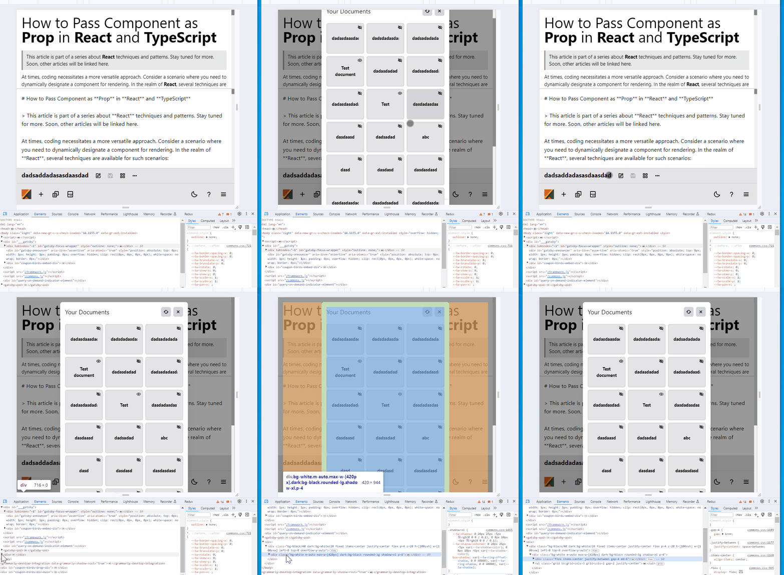
This is how it works in the app:
 Our Modal
As you saw in the GIF, the modal component is placed outside of the main <div id="root"> and is positioned just after.
Full Code
import React from 'react';
import { createPortal } from 'react-dom';
import c from 'classnames';

// useScrollHide.ts

const useScrollHide = <T extends HTMLElement>() => {
  const ref = React.useRef<T>(null);
  const initialStyle = React.useRef<
    Required<Pick<React.CSSProperties, 'overflow'>>
  >({
    overflow: `auto`,
  });

  React.useLayoutEffect(() => {
    const getElement = (): HTMLElement => ref.current ?? document.body;

    const show = (): void => {
      const element = getElement();
      const style = initialStyle.current;

      element.style.overflow = style.overflow;
    };

    const hide = (): void => {
      const element = getElement();
      initialStyle.current.overflow = element.style.overflow;

      element.style.overflow = `hidden`;
    };

    hide();

    return show;
  }, []);

  return [ref] as const;
};

// useScrollHide.ts

// usePortal.ts

const isServer = (): boolean => typeof window === `undefined`;

const usePortal = () => {
  const wrapper = React.useMemo(
    () => (isServer() ? null : document.createElement(`div`)),
    [],
  );

  React.useLayoutEffect(() => {
    if (!wrapper) return;

    document.body.appendChild(wrapper);

    return () => {
      document.body.removeChild(wrapper);
    };
  }, [wrapper]);

  return {
    render: (children: React.ReactNode): React.ReactPortal | null =>
      wrapper ? createPortal(children, wrapper) : null,
  };
};

export { usePortal };

// usePortal.ts

// modal.tsx

interface ModalProps {
  className?: string;
  children: React.ReactNode;
}

const Modal = ({ className, children }: ModalProps) => {
  useScrollHide();
  const { render } = usePortal();

  return render(
    <div className="bg-black/40 dark:bg-white/20 fixed items-center justify-center flex p-4 z-20 h-[100svh] w-[100svw] left-0 top-0 overflow-y-auto">
      <div
        className={c(
          `bg-white m-auto max-w-[420px] dark:bg-black rounded-lg shadow-xl p-4`,
          className,
        )}
      >
        {children}
      </div>
    </div>,
  );
};

export default Modal;

// modal.tsx
Summary
As you saw, creating a robust modal requires some tricky stuff in JavaScript. It's not rocket science, but it's important to know how to implement it correctly.
Fortunately, there's a proposal for a native modal, and here's how the support currently looks: https://developer.mozilla.org/en-US/docs/Web/HTML/Element/dialog.
So, in the future, there may be no need to implement such components manually.
Searching for a mentor in any web technology like React, Cypress, Node, AWS, or anything else? Maybe you have a single problem and just want to solve it quickly so you can continue with more important work? Good news! We are a company focused on mentoring, education, and consultation aspects. In addition, we craft apps, educational materials, and tons of articles. If you're interested, here are some useful links to contact us and access our educational materials 🌋🤝
Bullshit Meter
Looks solid
Bullshit score
0.0/10
Comments (0)
No comments yet
Be the first to comment on this document.